


Compensation Metrics HR and Managers Need to Know

At a time when the economic fallout from the COVID-19 pandemic is creating uncertainty, it is also flattening wage growth. Open conversations about pay have become much more critical for employee engagement and productivity. In response, many companies are reworking their compensation philosophy and policies or planning to do so. In this article, we aim to provide you with useful compensation metrics to manage these challenges better.
The purpose of this article is not to teach you how to manage compensation. We’ll leave that to compensation professionals. However, with compensation having a pivotal role in your company culture, everyone should understand how compensation works, and conduct a basic compensation analysis.
It is even more important that this information enables managers, HR staff, and others to have critical conversations with employees to help them understand their pay.
This knowledge will make it easier for managers to manage pay on their teams and help their team members understand what they can do to increase it.
What are compensation metrics and formulas?
Compensation metrics are the tools you use to measure, analyze, and decide how effective your compensation practices and policies are and what you can do to improve them. They help you “understand how pay is distributed across your team, so you can make informed decisions that will help you attract and keep employees.”
Compensation formulas help you create effective pay structures and help people within your organization understand them.
Why should you track compensation metrics?
Knowing the compensation metrics and the pay structures in your company will enable you to:
- Provide compensation packages that support your organization’s objectives and business strategies.
- Achieve a strategic advantage in talent by aligning pay to market realities. Competitive salary affects both your recruiting strategies and your current workforce.
- Create pay ranges or bands to make administration easier.
- Measure pay equity and fairness within teams and across the organization.
- Understand whether you are paying people fairly to help you prevent legal issues related to pay discrimination.
- Remain competitive in how well you attract the right talent.
- Analyze compensation and turnover to see what impact your policies are having on retaining the right employees.
- Retain productive employees, and
- Encourage poor performers to leave.

Useful compensation metrics for your organization
Let’s have a look at the formulas and metrics related to defining pay ranges, applying pay policies, and using metrics to identify areas that need your attention.
Defining pay ranges
Salary or pay bands/ranges rank job pay by experience, education, and level of responsibility.
Jobs with similar rank are grouped into bands, which are typically wider than ranges. They often include smaller market-based ranges within each band.
Pay ranges assigned to classes or groups of jobs provide both consistency and equity across jobs and the flexibility to plan to respond to market conditions.
Target Percentile
The first step and best practice in compensation planning is defining your company’s pay policy.
Your company’s target percentile is where you pay employees relative to market rates, expressed as a percentile.
If your policy is to meet the market, your target percentile will be 50. Anything over the 50th percentile is leading the market. Targets below the 50th percentile are lagging the market.
If your policy is to pay twenty percent above the market rate, your target percentile is 20 percent above the 50th percentile. It is the 60th percentile, not the 70th percentile (50+20).
Target Percentile = Market Rate × (1 ∓ Policy Percent)
50 × (1 + 20%) = 60
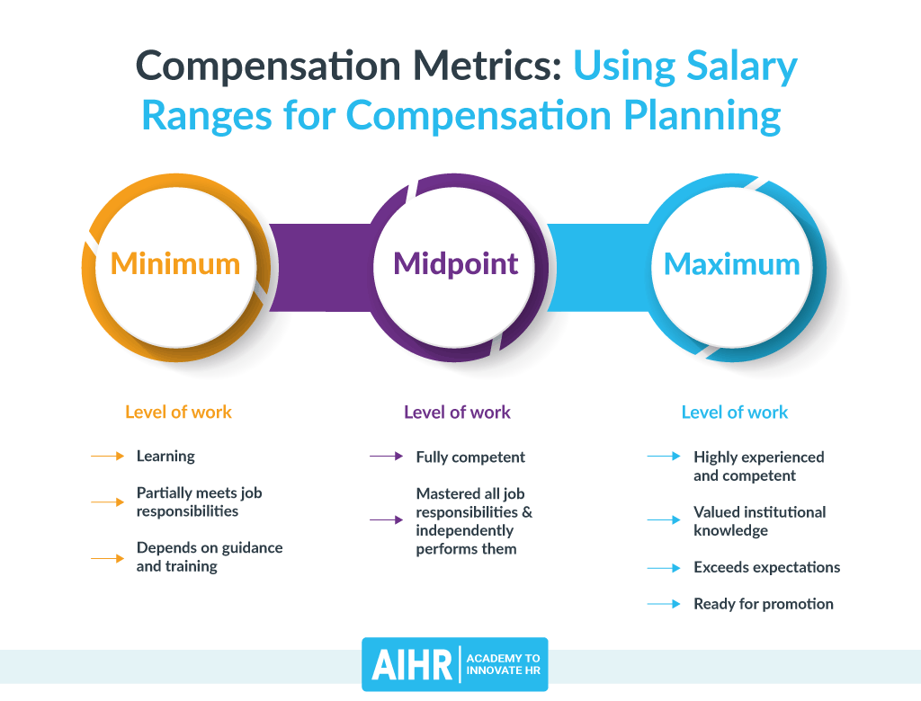
Range Midpoint
Your policy defines the midpoint of pay ranges with the target percentile. That becomes the data point your company and your HR team use to assign a value to a job or group of similar positions. A seasoned employee would expect to be paid at or near that rate.
The midpoint of the salary range is a handy tool for managers to explain the progression of salaries and jobs in their development conversations with their team members.
If your policy is to pay below the market, the policy percent will be a negative number.
Leading the market:
Midpoint = Market Rate × (1 + Policy Percentage)
To lead the market by 30% if the market rate for a job group is $46,000:
$46,000 × (1 + 30%) = $59,800
Lagging the market:
To lag the market by 10% if the market rate for a job group is $46,000:
$46,000 × (1 – 10%) = $41,400
Range Spread
Once you have midpoints defined by the policy percentile, the next step is to calculate the spreads.
Salary survey or market data usually show you values for percentiles related to the market rate: 10th percentile, 25th percentile, on up to 90th.
You could define the range minimum as the 75th percentile and the maximum as the 75th percentile. However, salary surveys differ and change frequently. It may be better to define a consistent range spread. Business and Learning (BLR©) offers this example:
- Manufacturing or service jobs – 20% to 30%
- Clerical or technical jobs – 30% to 40%
- Supervisory or professional jobs – 40% to 50%
- Management or executive jobs – 50% or more
Once you have defined the policy midpoint and the spread, you can calculate the range.
Range Minimum
Also known as the starting pay point, the minimum is viewed as the lowest value in the scale, typically what you would offer a new employee.
Companies sometimes raise the starting pay point to compete in the local market without adjusting the pay range definition.
Minimum = Midpoint / (1 + (Desired Range Spread / 2))
If your midpoint for a range is $50,000, and the spread is 40%, the minimum will be:
$50,000 / (1 + (40 % / 2) = $41,667 (rounded)
Range Maximum
Your compensation and benefits managers usually define pay policy as a percent above the range midpoint.
It is the highest value in the pay range—what your executives believe they should pay the top talent in your organization.
Maximum = Minimum × (1 + Desired Range Spread)
Using the example for the range minimum above, we can calculate the maximum like this:
$46,667 × (1 + 40%) = $58,333 (rounded)
Tip: If you only have the minimum and maximum, you can calculate the spread as a percentage or a ratio.
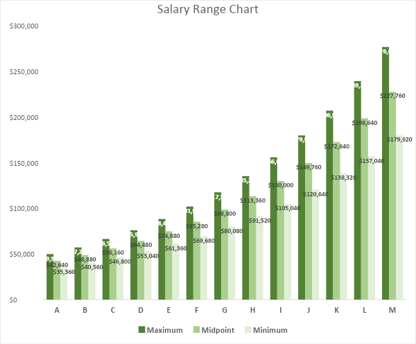
Range calculations make it possible to create an Excel worksheet that has the information for each range in a group, as in this table:
Range Spread Minimum Midpoint Maximum A 40% 35,360 42,640 49,920 B 41% 40,560 48,880 57,200 C 42% 46,800 56,160 66,560 D 43% 53,040 64,480 75,920 E 44% 61,360 74,880 88,400 F 45% 69,680 85,280 101,920 G 46% 80,080 98,800 117,520 H 47% 91,520 113,360 135,200 I 48% 105,040 130,000 156,000 J 49% 120,640 149,760 179,920 K 50% 138,320 172,640 206,960 L 52% 157,040 198,640 239,200 M 54% 179,920 227,760 276,640
Determining salary ranges helps you plan the compensation strategy of your organization.
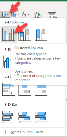
Salary Range Chart
We can create a chart in Excel. Select the data and select clustered column chart.
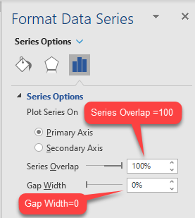
To make it a floating band chart, we:
- Set the Series Overlap to 100% and
- the Gap Width to 0%.
All that remains is to:
- Add data labels and position them at the inside end of the data point,
- Format the colors and font sizes you like, and
- Complete the chart title and formatting.
Other useful metrics and definitions
Salary Differential
Not to be confused with shift differential, location pay, adjusted cost of living, or other special assignments, salary differential shows the progression from one job level to another by comparing the two ranges’ midpoints.
Salary Differential = (Higher Midpoint – Lower MidPoint) / Lower Midpoint
If the midpoint of the higher job is $74,000 and the midpoint of the lower position is $64,000, the salary differential is:
(74,000 – 64,000) / 64,000 = 15.63%
Annual adjustments
Typically, ranges are reviewed and updated annually
Companies most often move the entire range by a percentage.
Sometimes they may increase salary by different levels to fine-tune them to the market or fix existing problems.
Forced distribution
Forced distribution of merit increases is a common practice that forces managers to manage increases within a budget.
HR Business Partners often need to help managers with merit increases. It’s easy to give everyone the same raise, which defeats rewarding performance with pay.
Compensation metrics
Compa-Ratio
Compa-ratio, or comparative ratio, makes it easy to understand where an employee stands relative to the midpoint.
You can also compare compensation among groups of employees to help you see potential problems in the way you pay employees.
Compa Ratio = Salary / Salary Range Midpoint
If the midpoint is $50,000 and the salary is $45,000, the compa-ratio is:
$45,000 / $50,000 = 0.9
For pay management, some organizations use a matrix of performance ratings, compa-ratio, and policy bands. Here is an example from WorldatWork, the global association of compensation professionals.
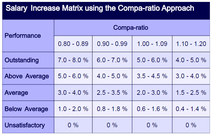
We don’t recommend trying this without automated systems to create the bands for you.
Salary Range Penetration
You can use salary range penetration along with compa-ratio.
Compa-ratio uses a single data point, while range penetration considers salary in relation to the whole pay range.
Salary Range Penetration = (Salary – Range Minimum) / (Range Maximum – Range Minimum)
If the minimum is $35,000, the maximum is $65,000, and the salary is $45,000, the range penetration is:
($45,000 – $35,000) / ($65,000 – $35,000) = 33.33%
Range penetration can help explain where employees stand. However, managers should be cautious, as an employee can begin thinking that they should be at 100% if they are a performing, seasoned employee.
The top of the range is often only granted to the highest-performing employees as a form of “golden handcuffs” to keep high-potentials from seeking faster progression in another company.
Using range penetration to analyze where all employees are in the range can help discover whether your ranges are too wide or narrow.
You can also use range penetration to target compensation to certain levels in the range.
For example, it may be new hires in the lower 25% of the range and the highest performers in the top 25% of the range.
Note: Helping managers explain compa-ratio and range penetration
If you tell employees they are performing well but don’t explain compa-ratio, they could begin to think they are underpaid. This could negatively impact motivation, engagement, and employee retention.
Help your managers have the conversation about where the employee is in salary progression and why.
When they see their range penetration, employees could believe they should be at 100% of the range.
Help managers with that conversation and have them focus the discussion on self-development.
Green Circle
Employees whose starting pay falls below the minimum are “green circled” and typically have their pay levels increased to the range minimum at the next review cycle.
If an employee’s salary is $38,000, the range minimum is $40,000, and the maximum is $60,000, the salary range penetration will be less than zero.
Here’s a sample green circle calculation:
($38,000 – $40,000) / ($60,000 – $40,000) = -0.1 (-10%)
Using an Excel worksheet, you could use conditional formatting to change the cell color to green.
Red Circle
Employees above the range maximum will probably have their pay frozen until salary range adjustments bring them back within the range. We refer to this as red circling.
Using an Excel worksheet, you could use conditional formatting to change the cell color to red.
If an employee’s salary is $65,000, the minimum is $40,000, and the maximum is $60,000, the range penetration will be greater than 100%.
($65,000 – $40,000) / ($60,000 – $40,000) = 1.3 (130%)
A common practice is to give the employee a lump-sum bonus at each review time until the range catches up to the salary.
Market-Ratio
If you want to see how close you are paying to where you target your pay policy, you can use the market-ratio. It compares the midpoint of the internal salary range to the market pay rate.
Market Ratio = Average Pay Rate / Market Rate at Your Target Percentile
If the market rate is $50,000, the target percentile is 15 (leading the market by 15%), and the average pay rate in a range is $60,000, the market-ratio will be:
$60,000 / ($50,000 × (1+15%)) = 1.04
Geographic Differentials
Companies often pay differentials for the higher cost of living in different areas. Most salary surveys have location differentials, and data are readily available from the Economic Research Institute.
We recommend showing geographic differentials as a separate item from base pay so your people can easily see that you are compensating them for their higher cost of living.
This is an especially relevant topic now that many companies are transitioning to permanent remote work. While some companies will use geographic differentials to adjust salaries, others will keep the salaries as they are.
Compensation metrics analytics examples
Sometimes all you need to analyze your pay practices is a worksheet with filters.
An Excel worksheet with employee information can help you quickly set up comparisons.
At a minimum, you would want to have:
- Employee information;
- Hire date;
- Business unit and location;
- Job;
- Grade or band;
- Employee salary;
- Range minimum, midpoint, and maximum;
- Compa-ratio and range penetration;
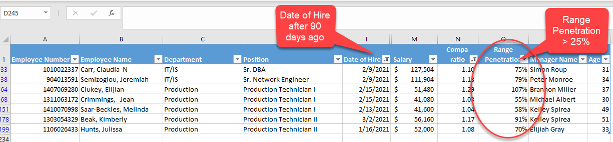
New Employees Above 25% Range Penetration
Many companies have policies about range penetration and tenure.
If new employees should be in the first quartile of the pay range, you can use filters in a worksheet to determine any are above the 25% mark.
In this example, we filtered our worksheet to show only employees hired in the past 90 days whose range penetration is greater than 25%.
NOTE: Using pivot tables for compensation analysis
We often use pivot tables to do ad hoc analysis to summarize and compare large datasets of equity information. One of the most common is to look for signs of potential disparities.
If you want to learn about getting started with pivot tables, see our article on Human Resources Excel Formulas and Functions to see how to get started.
Compa-ratio by Ethnicity
Here we look at the compa-ratio of employees by ethnicity to see if there might be disparities and problems with internal equity.
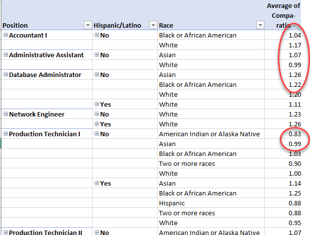
Pay Inequities by Gender
This pivot table uses the average of the compa-ratio to compare pay levels by gender.
NOTE: Be careful with assumptions
We caution against using a single data point to make judgments. The data points in a summary table identify where problems may exist, but only a thorough investigation will show the actual reasons.
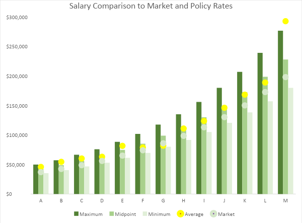
Salary Chart with Metrics
We can visualize range penetration and compare salary averages to the market rate by adding the data to our Salary Range Chart, then creating a chart.
- Add average salary and market rate to your data table.
| Range | Maximum | Midpoint | Minimum | Average | Market |
| A | $49,920 | $42,640 | $35,360 | 45946.47 | $37,078.26 |
| B | $57,200 | $48,880 | $40,560 | 54522.49 | $42,504.35 |
| C | $66,560 | $56,160 | $46,800 | 60231.26 | $48,834.78 |
| D | $75,920 | $64,480 | $53,040 | 63125.59 | $56,069.57 |
| E | $88,400 | $74,880 | $61,360 | 81611.08 | $65,113.04 |
| F | $101,920 | $85,280 | $69,680 | 78847.24 | $74,156.52 |
| G | $117,520 | $98,800 | $80,080 | 81855.58 | $85,913.04 |
| H | $135,200 | $113,360 | $91,520 | 111017.25 | $98,573.91 |
| I | $156,000 | $130,000 | $105,040 | 123748.22 | $113,043.48 |
| J | $179,920 | $149,760 | $120,640 | 146085.17 | $130,226.09 |
| K | $206,960 | $172,640 | $138,320 | 168317.96 | $150,121.74 |
- Create a clustered column chart with the data.
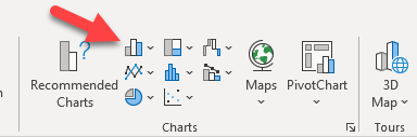
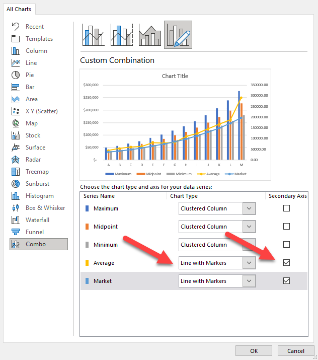
- Right-click on the chart and select Change Chart Type.
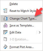
- Change the Average and Market series to Line with Markers.
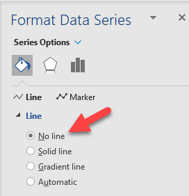
- Set the Series Overlap to 100% and the Gap Width to 0%.
- Set the Average and Market lines to No Line.
- Format the colors and font sizes you like.
- Complete the title and formatting.
Over to you
Which compensation metrics you use depends on what you want to know or do. Having at least a fundamental understanding of these compensation metrics helps HR department members and managers have conversations about pay—and enable you to manage compensation better.
Weekly update
Stay up-to-date with the latest news, trends, and resources in HR

Learn more
Related articles


Are you ready for the future of HR?
Learn modern and relevant HR skills, online
